 One
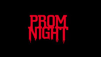
common trait I found was that many of the titles were in a red font
over a black background. From this I already knew that I wanted to use
this colour scheme in our own production as both
One
common trait I found was that many of the titles were in a red font
over a black background. From this I already knew that I wanted to use
this colour scheme in our own production as bothcolours have strong connotations of horror.
Once I had more of an understanding of which colours to use, I chose 4 of the best fonts from the horror section of dafont.com
I put the fonts into a word document and then passed this out and gathered some audience feedback from each option, as well as asking which one appealed to them most.
I asked this to people who fit into our target audience.
Option 1)
- Fits well with horror (genre)
- Doesn't look 'scary enough'
- The 'N' is a bit unclear
- I like the dripping from the letters
- Looks like blood
- This one is my favourite because the words are clear and because of the dripping down from the letters.
- The letters are too bold
- Wouldn't fit as well with horror
- Looks too similar to another horror movie
- Not very easy to read
- Would fit well in the film
- Letters are too close together
Overall, the people I asked preferred the top two fonts, so I decided to go with option 2 as i also found it very easy to read, but still in keeping with the horror genre.
I then imported the font into Final Cut and experimented a bit with a few different colours/sizes.
I tried to created a smoke effect surrounding the letters, inspired by the titles of The Cabin in the Woods, however i thought that this looked a bit too generic and boring. I then had an idea, inspired by the famous television scene from Poltergeist of adding an "Old TV" filter. I found that this worked very well and decided to go with that.
For the titles we didn't really challenge conventions but instead used them. However, by using the TV filter to the titles I think that I added an individual look to our film opening.

No comments:
Post a Comment
All comments are moderated.