We decided to do our film opening in the horror sub genre. The genre conventions of horror are very clear and it's normally very easy to identify when a film is horror. However, in terms of character, we decided to challenge this and have included a counter-type in our film opening.
MISE-EN-SCENE
The mise-en-scene played a very large role in our film opening, especially as plays a part in conveying the genre to the audience.
For the basement scene, we wanted it to look very sinister. We started off by looking at some other different horror or slasher films that had a similar scene that we could take inspiration from. One film that definitely inspired us a lot was The Texas Chain Saw Massacre. (Hooper, 1974)
In this film, the "killer" figure has a sort of room which has a lot bones on the walls and there is low-key lighting.
We decided that the bones was a good idea, so we actually used some meat that had a lot of bone on it. We cut away the main part of the meat.
We also bought some string that we thought looked appropriate, and tied the meat to the ceiling of the basement we were using.
We ran a knife along the string to make it look more frayed.
We also went and bought a role of thin plastic, which we hung down from the ceiling, as well as two big thicker plastic sheets which we hung behind the chair. We covered these sheets in fake blood.
Our basement mise-en-scene was inspired by looking at many different basements in horror films. For example, The Conjuring, The Cabin in the Woods.
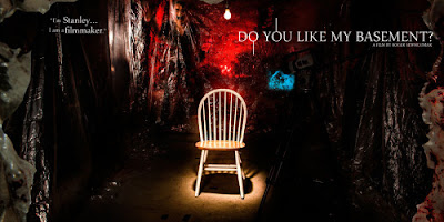
One film that I thought was a very good one to look at was "Do you like my Basement" ( Roger Sewhcomar, out on Netflix) This is a film poster for the film. As you can see, there is a chair surrounded by plastic sheets and blood, which really anchors the horror genre.
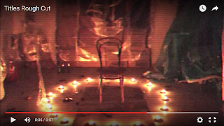
Below is a scene from one of our rough cuts, which is very similar to the one above.
We thought candles were more effective than having lights as they are more conventional of the horror genre.
Representation
The main Character:
Our main character challenges the usual convention of the main character in a horror film, which is that of a Scream Queen. I have blogged more in detail on this character type previously, however, essentially the Scream Queen is usually blonde, very stupid and over sexualised.
Why did we want to challenge this convention?
- We wanted to show a more positive view of women in our production, as we wanted the main character to be more of a 'role model' to the slightly younger demographic of our audience.
- We wanted our film to stand out: There are many horror films, mostly with the scream queen as the main character, and we wanted ours to be a bit different in order to attract an audience.
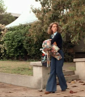 The character of the final girl in film is the opposite of the Scream Queen, she is intelligent, often brunette and usually does not die.
A famous example of a final girl is Laurie from Halloween (John Carpenter, 1978). Her character is very clearly the final girl type as the books have connotations of intelligence. Also her costume is plain and not revealing.
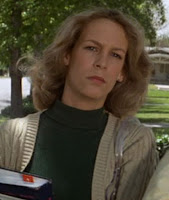 In our main character's bedroom we took some books and placed them on her bedside table. This connotes again that she is intelligent and studious.
 Her costume:
For her costume, I chose a white t-shirt in order to show the character's innocence, as white connotes purity and innocence.
I chose plain blue jeans as they are neutral and a skirt would be more typical of a scream queen character.
She ties her hair in a ponytail because it represents the fact that she is practical.
I also chose the duffle coat for her costume as it's classical and again shows her innocence and simplicity.
To summarise, the main way in which we challenged convention was through the main character, through her costume and character. We thought that it would be good to challenge this idea of the scream queen character as it would make our film a little more individual which is crucial when attracting an audience, and also that we wanted a more positive image (more intelligent, less provocative) of a main female character to be presented to the female demographic of our audience.
The Killer:
For the killer, the outfit was pretty straightforward. We quickly came to the conclusion that black was a colour greatly linked to killer's costume as it has connotations of darkness and death.
Therefore, Jon wore a black hoodie with black jeans and big black boots.
If you look at the costume of Michael Myers (the killer from Halloween) you can see that
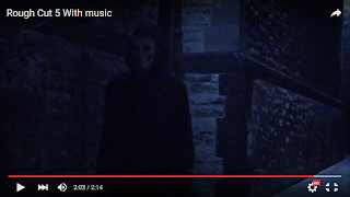 he inspired us.
 The idea of having a mask actually came from Halloween and Saw.
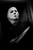
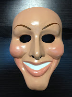
We decided to have the mask look more like an actual face (so skin-coloured, with cuts and bruises) as this is something that features in the film Purge (James DeMonaco, 2013) and the sequel to that, The Purge: Anarchy (James DeMonaco, 2014) Here is an example of the mask from these films:
For the mouth area of the mask, we took some inspiration from the character of The Joker.
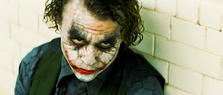 We
added cuts to the side of the mouth in order to represent this. We
decided that blood and cuts were a good thing to add to our mask also
because they are a very common feature in the horror genre. The dark
shadows around the eyes on the mask were also inspired by The Joker, and gives a very sinister feeling, again anchoring the horror genre of our film opening.
 The titles:
I was the one who created the titles for our film. I started by looking at fonts from other horror films.

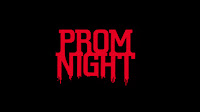 One common trait I found was that many of the titles were in a red font over a black background. From this I already knew that I wanted to use this colour scheme in our own production as both
colours have strong connotations of horror.
Once I had more of an understanding of which colours to use, I chose 4 of the best fonts from the horror section of dafont.com
I put the fonts into a word document and then passed this out and gathered some audience feedback from each option, as well as asking which one appealed to them most.
I asked this to people who fit into our target audience.
Option 1)
- Fits well with horror (genre)
- Doesn't look 'scary enough'
- The 'N' is a bit unclear
- I like the dripping from the letters
- Looks like blood
- This one is my favourite because the words are clear and because of the dripping down from the letters.
- The letters are too bold
- Wouldn't fit as well with horror
- Looks too similar to another horror movie
- Not very easy to read
- Would fit well in the film
- Letters are too close together
Overall, the people I asked preferred the top two fonts, so I decided to go with option 2 as i also found it very easy to read, but still in keeping with the horror genre.
I then imported the font into Final Cut and experimented a bit with a few different colours/sizes.
I tried to created a smoke effect surrounding the letters, inspired by the titles of The Cabin in the Woods, however i thought that this looked a bit too generic and boring. I then had an idea, inspired by the famous television scene from Poltergeist of adding an "Old TV" filter. I found that this worked very well and decided to go with that.
For the titles we didn't really challenge conventions but instead used them. However, by using the TV filter to the titles I think that I added an individual look to our film opening.
How does our film represent social groups or issues?
In our film opening, we included only Caucasian characters. This was not deliberate, however, we only show two characters (as the amount of characters in horror is very limited) and as the country/area we live in has a large Caucasian population, this would be accurate. However, if we were to be filming a full length film, we would be sure to include characters of different ethnic groups.
In order to represent different nationalities, we included both a British and an American character.
This means that our film would appeal to both an American and a British audience, and also shows diversity.
We have no negative stereotypes surrounding accents, homosexuality or ethnicity, as we didn't want our film to be offensive in any way.
Our film is hegemonic and normative, but this would have been very hard to avoid.
As there are limited amounts of characters in our film, it would be difficult to show a large amount of diversity, however if it was a full film, we would consider including a black or homosexual character in our film (represented in a positive way)
In conclusion, we did our best to show diversity in terms of nationality/accents.
http://asmediafilmopening.blogspot.lu/2016/03/evaluation-cie-q1.html


Can't see the Q itself (also too small)
ReplyDelete'We decided to do our film opening in the horror genre.' think SUB-genre...
As discussed: focus 1st on clearer themes/elements: titles, idents etc. Evidence clearly your grasp of/research into these (clips, screenshots, you can use screenshots/links from your own blog posts too), then with each one show and discuss what you did (which will in most cases reflect the conventions you've evidenced)
You can use existing vodcasts, splitting up the completed vodcast in Final Cut and adding in analysis of your work
If you're sticking to a post, make it neat and the information easy to locate