Tuesday, 26 April 2016

Evaluation Question 4: Integrating Technologies TBC


How did you integrate technologies - software, hardware and online - in this project?

The technologies that we used throughout the course of the year really helped us to produce our blogs (evaluation questions included) and also our film opening.

Hardware


Camera
The camera that we used throughout the process of filming was the SONY A58 we borrowed this from the school media studies department.
Before filming, I viewed a guide online of the various functions of the camera to familiarize myself with how to use it.

I learned different functions such as how zoom in and out and the difference between taking photos and filming and how to change between the two. We used this camera for every piece of filming we did.

As I was acting in the film, this meant that I had less opportunity to film scenes. However, I did some filming on the establishing shots/ shots I wasn't in.

I also filmed all of the directing done by Jon and Sophie.

An example of a technique we used with this camera was deep-focus. We utilized this in the church scene when filming the candles.

We used manual focus throughout filming as in our Swede (a preliminary exercise) we found that the auto focus created a clicking sound which was very distracting. The auto-focus also made our short swede go in and out of focus which was very annoying. As I said, we used manual focus to avoid this.


The Tripod
At the beginning of the year, we started by using a Cullmann CB6 Tripod. This was provided by our school. However, It was quite shaky.
Before beginning filming, we received a new Mantona Scout tripod which was much sturdier and easier to use.
As the tripods were very simple to operate, it wasn't very hard to use them. I had also used a tripod in my Gcse Media therefore I knew how it worked


We used a tripod in almost every scene we filmed as we knew how important steady footage is and the tripod insured the footage was steady.

The scene in which we didn't use a tripod was towards the end of our film opening, during a POV shot. This was for effect as the slightly shaky footage provided tension and suspense.


SD card
We used my Kingston 8GB SD card. If we were to do this project again, I would have chosen an SD with more storage, simply down to the fact that we ran out of space a couple of times during filming and had to stop filming to import it onto a Mac.

The SD was very easy to use as all of our laptops had SD card slots, making it easy to transfer footage through it.

Something that could have helped us, would have been to have another SD card on us at all times incase something went wrong during filming.

Smartphone
I used my phone a lot during the entire process.

Firstly, I used it to record audience feedback. It was very useful for this as I always had my phone on me and so, whenever there was an opportunity to record or get some audience feedback, I just quickly filmed it on my phone. 

My phone also allowed me to access my emails and messages quickly meaning I was in touch with my team mates at all times. 


Laptop/computers
When in school, i tended to use the computers provided by the school (Fujitsu) however, I actually had quite a lot of difficulties when using blogger on these computers (I couldn't embed videos, and the font size/colour kept changing after publishing the post). 

Therefore, I did all of that at home on my own personal laptop (ASUS).  

I also borrowed Sophie's laptop when doing some editing as my laptop is not a mac and so I couldn't use final cut on it. 


Software/Online

Final Cut Pro
The editing software that we used was Final Cut Pro. When starting this project I didn't know how to use the program at all as I had never used it before. However, It was very easy to pick up. I looked online at a couple of guides on the different tools and what shortcuts there were. I figured out how to change the font size and colour by myself but it was very clear and easy to use, so it didn't take long at all to figure out. 
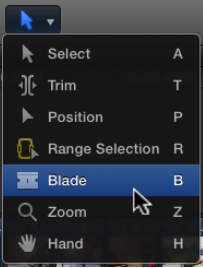


I have created a quick guide of the tools. 

The first one is Select. (cmd A) This is just the usual arrow that you would use to drag clips in to place, or re-arrange them. 


The Trim tool (cmd T) can be used to cut the end or beginning of a clip. For example, if you want to shorten a scene/clip, you just change to this tool and then drag away however much you want 


The Position tool (cmd P) manually places a clip in a specific location without involving other clips. 
If you drag a clip over another using this, it will overwrite it. 


The Range Selection tool (cmd R) allows you select a certain section of a clip. This is very useful when importing footage, as you can select a certain part of the footage to add to your timeline. 

The Blade tool (cmd B) is used to 'cut' a clip. To do this you just select the tool and then click on the place where you want to split the clip. 

The zoom tool (cmd Z) is pretty self-explanatory, you can just use this to zoom in or out on the timeline. 

The last one is the hand tool (cmd H) and it allows you to move the Timeline back and forth

Sony Vegas Pro


Because I don't have a mac, when I was at home, I used Sony Vegas Pro to edit things I did. I didn't actually like using it very much as it was complicated to use compared to Final Cut. The layout was a bit confusing to me and it took a while to get used to .
I much prefer using Final Cut as its much more simple and easy to understand and work with. 

Facebook 
To communicate as a group, we used a chat. 
This was extremely useful as we could share photos and links among ourselves.
 We also could discuss things about our film, such as whether it was going to be an indie film or not. 
It was also very useful for arranging when to meet up to do filming or other things that were coursework-related.  


 Google Drive 
Another way in which we integrated technologies was through Google Drive. This is a screenshot of what our Google Drive looked like at one point during the year:


 This again, was really useful as it allowed us to share clips and videos to each other. This was actually my first time using google drive but I found it really straightforward and easy to work with. 
Jon set it up and then Sophie sent me an invitation to edit it over gmail which enabled us to share content onto it. 
I would really recommend this as a way of sharing videos as its very quick and easy to use. 

Skype
Finally, me and Sophie used Skype to work on our coursework together, usually on weekends. 
We actually used this when doing evaluation question 3, as we screen-recorded our chat show style Skype session. 
 Skype was very practical and helped us a lot when we wanted to discuss something that would be too complex over text/chat and would take a while to talk about. 
 

Friday, 22 April 2016

SR: Audience Feedback: Titles

After having created a title sequence, we screened it for some students and our media teacher in class. This post is going to contain the videos of the feedback and the title sequence.

Here is the title sequence:


This is some audience feedback we got from our teacher and from students who gave us their opinion on the fonts we should use and the transitions we should use when introducing the titles:


Our teacher commented a lot on the font, where we were told that it would be good to use "The Friday the 13th" font, since it denoted that we were inspired from that film for our titles.

We didn't really agree with the audience feedback that we got from the students, since they really disliked the "Friday the 13th" font. However, they gave us useful feedback for the transitions.


Thursday, 21 April 2016

JP: UPDATE: Our new Working Title explained


After having created our rough cut 6, we came to the conclusion, that our working title "Not My Face" did not suit our film. Therefore, we decided to sit back down to brainstorm on the title for our film opening. We looked into something that has to do with religion as well as media, since our final girl is religious. We brainstormed on different words such as angles, heaven, hell, cross and many more. We ended up, deciding on "Cross-Cut", which we thought to be very suitable, since it comes from a media term (e.g. "cross-cutting") also known as parallel editing. It is used when there are two or more scenes happening simultaneously on screen but at different locations and times. 

The main female character in our film is religious. We denoted this by having a scene where she goes to church, as well as her picking up and forgetting her bible. This introduces a double meaning with our title, since it refers to the editing technique as well as the religious aspect of our film.

Wednesday, 20 April 2016

SR: Podcast 3: Sound

This is a podcast that I created on soundcloud to explain what we have done in terms of sound for our final cut. It explains step by step what we did and where we got sound effects from.
 Sophie's Soundcloud

Monday, 18 April 2016

SR: Podcast 1: Counter-Typing

This is a podcast I did to explain why we might the choice to counter-type and what exactly we did counter-type. Below the podcast you can see the script.


"This is my podcast in which I will be explaining how we counter typed the normative stereotypeof the female protagonist in our media product. 

There are more types of social groups and issues raised in movies than people would usually think about. Some of the typical social groups include age, gender, ethnicity, sexuality and most of allstereotyping. There are normative stereotypes, such as the usual scream queen, who is portrayed as a dumb blonde and then there are counter hegemonic stereotypes, where you challenge the normative stereotypes
This is what we specifically did in our film opening we challenged the normative stereotype of the final girl and scream queen

Again, the stereotypical norm of the scream queen is an unintelligent blonde, such as in the movie scream, who is sexually active and ends up getting killed in any horror movie.
Whereas the normative of the final girl is a character with brown hair, who is denoted as intelligent and clever and who is virtuous. Usually a final girl is always the one that gets away and doesn’t end up getting killed. However, we decided to get a girl with brown hair, all of these qualities, but who would still end up getting killed by our psychotic masked killer anyway. We did this on purpose to counter type the stereotypical normative of the final girl and got good feedback for doing so."

Sunday, 17 April 2016

SR: Titles for our Rough Cut 6

Titles for our Rough Cut 6 

After having gotten feedback on our Rough Cut 5 with music, we decided to change the font of the titles. 


As you will be able to see in the first postBronwen did on titles, there are common conventions of horror/slasher titles in the specific movies we analysed such as "Insidious", "The Cabin in the Woods", "Friday the 13th" and many more. You can see in my link list on my blog, which horror/slasher genre movies we analysed. 
Some movies, such as Halloween, did not have the typical conventional fonts of a horror movie (look at the picture on the left). However, it is also to note that this movie was produced in 1978, and the technology to create fonts such as the ones from the movie "The Cabin in the Woods" did not yet exist. 
After the feedback that was given on rough cut 5, we had to change a couple of things including the titles. Since Bronwen had created the titles for rough cut 5, I wanted to do the ones for rough cut 6 so that I could learn how to use Final Cut Pro X to create titles. 
I decided to use the font called "Friday the 13th", which I found on dafont.com. I considered this font to be just the one, since our coursework has something in common with all the "Friday 13th" movies. The killer in the friday 13th movies is called Leather Face. It is a typical slasher convention, that the killer is a psychotic masked person. Therefore, I intended to use this font as a connotation that our film opening and the friday 13th movies are in some way linked to eachother. 

The font is red, which denotes the blood and danger that is in the movie.  Also, it is written as if someone had written it with blood so that it is splashed a bit all over the screen, denoting that a lot of blood is going to be spilt. 

We created a video where we did a titles rough cut with 3 different ways of introducing the titles. This video is going to be shown to some of our target audiences, who are then going to tell us which of the 3 title sequences they consider to be better fitting for our final cut and why they think this. The audience feedback will be done soon, so that I can include it into my evaluation questions.


I also decided to do a vodcast on this post, since I thought it would help the audience to see by which titles we were inspired and why we chose these specific titles.


Furthermore, I decided to screen recording, while I was doing the titles, so that I could explain how to do those in detail using Final Cut Pro X. We wrote down a list to make sure that we got all the titles that we needed. These were:

Starring:

Under starring we wanted to write 3 star names from movies we have been inspired by. Therefore we chose names such as Chris Hemsworth and Kristen Connolly from "The Cabin in the woods" and Adrienne King from "Friday the 13th".

Introducing: 

Under this, we used the actual names of the 2 of us that had played in the film.
Bronwen Vaughan
Jonathan Paris

Edited by:

Jonathan Paris

Cinematographer:

Bronwen Vaughan

Produced by: 

Jonathan Paris

Producer:

Sophie Rasmussen

Co-producer:

Bronwen Vaughan

Sound by 

Max Genson

Director:

Sophie Rasmussen


Below you can see the video of the titles I created:

SR: Rough Cut 5 - With Music

This is the 5th full rough cut in which I added the non-diegetic music that I worked on with max on Friday afternoon.


There was a need to put in non-diegetic music in every scene, to create tension in the film opening. Very often a horror movie can only be good if it has very good music that manages to build up tension. I was glad, that according to our audience feedback that we got from our Year 13, we had already managed to build up some tension with the shot variety we used. This was a good sign, because it meant that it was already good without having even added ANY music yet.

I am going to explain, what exactly we did and how we processed this music task with the use of a podcast and illustrating pictures and videos.

Furthermore, I have recorded videos of Max where he is explaining what software he used for this.


SR:Vodcast 4: Titles for our Rough Cut

This is a vodcast that Sophie created for which explains, which movies we have been inspired by for the titles and which font we are going to use.


Saturday, 16 April 2016

Titles for our Rough Cut 5

I created some titles for our rough cut 5. However, after some more feedback we realised that we could do better on the titles and make improvements to them. We wanted to animate them by making the letters drip down like blood. This is something that Sophie looked at.

One common trait I found was that many of the titles were in a red font over a black background. From this I already knew that I wanted to use this colour scheme in our own production as both
colours have strong connotations of horror.   
(Cabin in the Woods)


Once I had more of an understanding of which colours to use, I chose 4 of the best fonts from the horror section of dafont.com 

 I put the fonts into a word document and then passed this out and gathered some audience feedback from each option, as well as asking which one appealed to them most. 
I asked this to people who fit into our target audience.

Option 1) 
  •  Fits well with horror (genre)
  • Doesn't look 'scary enough'
  • The 'N' is a bit unclear
Option 2) 
  • I like the dripping from the letters
  • Looks like blood
  • This one is my favourite because the words are clear and because of the dripping down from the letters.
Option 3)
  • The letters are too bold
  • Wouldn't fit as well with horror
Option 4)
  • Looks too similar to another horror movie
  • Not very easy to read
  • Would fit well in the film
  • Letters are too close together

Overall, the people I asked preferred the top two fonts, so I decided to go with option 2 as i also found it very easy to read, but still in keeping with the horror genre. 

I then imported the font into Final Cut and experimented a bit with a few different colours/sizes. 

I tried to created a smoke effect surrounding the letters, inspired by the titles of The Cabin in the Woods, however i thought that this looked a bit too generic and boring. I then had an idea, inspired by the famous television scene from Poltergeist of adding an "Old TV" filter. I found that this worked very well and decided to go with that. 

For the titles we didn't really challenge conventions but instead used them. However, by using the TV filter to the titles I think that I added an individual look to our film opening. 

Friday, 15 April 2016

SR: Coursework: Slasher sub-genre an overview

In our coursework as an example, we know that the main genre is horror. There are 4 main types of horror genres known as Psychological, Killer, Monster and Paranormal. Our coursework would be an example of the Killer one. These 4 main types can then be even more in depth and have what is called sub-genres.


sub-genre or sub-genres are categories that are subdivisions to a larger genre. As an example, when looking at the table above, slasher genre is a sub-genre of the killer horror genre. So our coursework is also a slasher genre. In the small boxes, you can also see examples of movies that are in the slasher genre. In that box, there are examples of the two movies "Friday the 13th" and "Halloween". Our coursework is inspired from Halloween by John Carpenter from 1978 and therefore we can say that it fits perfectly with this table.

Below is a page of a slideshare presentation that I found:


As you can see a slasher film is as mentioned a sub-genre of the horror film genre. Our coursework is more slasher than horror since it contains several of the slasher elements. For example our killer is represented as a psychotic masked killer who keeps young girls trapped in his basement. Also, we were filming some shots where he should kill the final girl with a knife, which is used in slasher movies to  represent the sexual assault. It is also represented as a phallic object, which is taken from Freud's theory on the psychosexual stages. You can read more on the semiotic analysis of our idea in the post that i did called semiotic analysis. 

Monday, 11 April 2016

Bridget Jones's Baby: The Target Audience

This film is the third in the Bridget Jones series, therefore there is already a large fan base around this film.
However, this film arguably will attract an older audience due to the fact that Bridget is in her 40s, making it very difficult for a young female (and even harder for a male) audience to relate to her character.

Thursday, 7 April 2016

JP: Film Opening 8: Halloween (1978)


Director: John Carpenter
Genre: Horror, Thriller
Producers: Compass International Pictures, Falcon International Productions
Budget: $325k
Boxoffice: $47m


Halloween is a archetype of the horror genre which has inspired many popular films for decades. John Carpenter is credited as the director and creator, meaning he is the Auteur of the film.  John Carpenter's name appears in the title of the film which is significant because from the 1970's - 80's he was mostly known for creating Science fiction and thriller films.
I am analyzing this film because its opening sequence has heavily inspired our short film opening. 
Outlined below are some of the semiotics of Halloween which influenced our film idea. 

While the opening credits roll in, the camera slowly zooms into a jack o' lantern. This connotes that the movie is taking place in October when halloween is celebrated in North America. The Jack o' lantern is a famous symbol associated with Halloween and families across America carve them out as seasonal decorations. Seeing as the film was released close on October 25th 1978 and only in America, the audience would infer that  this is a horror movie.
during the credits there is non-diegetic, fast paced, ominous music which connotes mystery and suspense. The opening credits are written in orange Serif font on a black background, this makes use of the traditional colors associated with Halloween. The title sequence of the film already depicts an imagery and evokes a feeling of suspense, terror, and fear.
The first scene of the film is a continuous shot that start from a establishing shot of a house and follows the point of view of an observer into a side window where the first two characters are introduced. The opening shot is important because it signifies the perspective of an observer. Halloween is the story about a masked boogey man, thus the introduction of this shot signifies that the story is told from his perspective. This further anchors the horror and creepy elements of the film. The image on the right, as well camera-shake, demonstrates how the perspective of the boogey man, Micheal Myers, is achieved.

Saturday, 2 April 2016

Our Target Audience 2

I did an updated and more developed post on the target audience for our slasher film, following on from Sophie's post on target audience

For our film, we knew that we had to stick to a very specific and typical target audience. This is because the slasher genre has often been called an example of 'genre purism' essentially, this means that the conventions of the genre have been in place so long, and are so specific, that attempting to deviate too far from tradition or changing these conventions can result in a films financial failure. This leads onto how our film opening engaged with our audience/audiences, which I will be covering later on.


Typically, the target audience
for horror/slasher films is 15-25 years old. Although quite a few of these films have an age rating of 18, 15 year olds still have access to films online or on DVD, making it difficult to enforce these age ratings.


Here is the BBFC page for Saw, which shows the rating and explains why it was given.

So, deciding the age of our target was very straightforward, as we have the same target audience of the majority of slasher films that exist.


I found some statistics based around the ages and genders of horror movies.
As can be seen, the majority of horror film viewers are between the ages of 18 and 24.


To finish, the target audience of our film would be 15-24, and the secondary audience being 26-35.


Primary and secondary target audience


The primary audience is the audience that the film is primarily target at, so the main people who will watch the film, for example. When creating a film, the target audience is something extremely important to consider as failing to appeal to the target audience could result in the failure of the film.


The secondary audience are people who wouldn't go and watch a film by choice, but would perhaps be influenced by the primary audience. To explain, a young teenager who really wants to see a film (and would be the primary audience) could bring someone with them, a parent or a friend for example to watch it with them, making them the secondary audience.


So for our film, due to the fact that the second largest percentage of viewers of horror is 25-34, we decided that this would be our secondary audience.


Audience Gender
As seen in the pie chart, more men than women watch horror films. 
This is because they can interact or relate better to the characters on screen, and the main killer is normally a man.

Women are less attracted to horror, for reasons such as the negative portrayal of women in such films.
Character types such as the final girl are stereotypical and very negative.

However, including romance or aspects of romance in horror/slasher films also attracts women to the film, and making horror films good 'date films'; the romance aspects appeal to the women and the gory/horror aspects to the men.


Therefore, our primary target audience is men as they view horror more than women.
On the other hand, we actually wanted our film to appeal more to women than the average slasher movie, by representing our main character differently and ensuring that it would pass the Bechdel test. (I expanded further on this on another blog post.)

Friday, 1 April 2016

SR: Our Target Audience

The genre for our movie is horror/slasher. I did a post, where I was outlining and explaining what the typical conventions of the slasher genre were. 

Before doing this post, I decided to do some research to find out who our target audience and primary audience would be. We wanted to create a movie that appealed to both males and females. The typical hybrid genre ROM-COM is one of the main genres that the subsidiaryWorking Title is creating. However, ROM-COM's such as Love Actually or Bridget Jones Diary appeal more to the female audience because of the romance genre. It does on the other hand also appeal to some male audience because there is considered to be comedy in it. 
When I then did this research, I decided to look for the common types of movies that the general public enjoy watching and found these statistics from the British Film Institute from 2012, which show that the number of males and females below 35, that watch the horror genre is around the same.

Due to this, we came to the conclusion that our main target audience, were males and females from the age rate of 15 to 24 and that our secondary audience would be from the age of 24 to 35. Since, it is also unlikely that a slasher genre gets an age rate under 15, if there are violent scenes and sexual assault, we thought that 15 and above would be the correct age. 

Bronwen and I intend to do questionnaires later on where we will ask the audience what they think of our basic idea and what they would like us to change etc. 

Exam Practice: Agents of S.H.I.E.L.D


The clip analysed:


Firstly, the representation and issues raised in the clip are reflected through the characters and the character's costume.
To begin, the woman's costume signifies her femininity through the pink colour (which has girly/feminine connotations) of her shirt, and as well, the floral pattern on the shirt anchors this further.
Her shirt is also unbuttoned, which reflects how female characters are sexualized in film.

Moving on, the "bodyguard" character is a binary opposition to the female, due to his costume (amour, black etc.) and how he is represented mostly as strong.
His character is keeping to the criminal stereotype of the black male, as he checks another character for armour. Furthermore, his character is not present at the 'meeting' and neither is the female character which shows that they are 'less important'

An issue which is raised in the clip if the idea of the government going beyond the law.

Another issue is raised through technology. The bodyguard character has x-ray vision and this is representing the idea of the 'invasion of privacy'.

The editing further reflects the characters and the way in which they are represented.
The bodyguard and the female characters are being linked by the editing and shot selection. This is due to the fact that they both have severe injuries (although the female's are hidden). When the bodyguard character asks if she has any more masks lying around, this creates a link between the two of them, which is echoed further as they appear together frequently in two-shots.

In the meeting scene, there are no two-shots between characters as this represents the binary opposition between them.
The use of a pan between these characters, again demonstrates the attitude gap that is present.

However, at certain points, there are 2 shots, and there are some links drawn between the two of them which relate to the script.