This is the final cut of our 2 minute slasher film opening. There hasn't been much changes made from the last rough cut, other than Sophie created the final titles.
Bronwen Vaughan Media Studies
Wednesday, 27 April 2016
Tuesday, 26 April 2016
Evaluation Question 1
"How do your products use or challenge conventions and how does it represent social groups or issues?"
We decided to do our film opening in the horror sub genre. The genre conventions of horror are very clear and it's normally very easy to identify when a film is horror. However, in terms of character, we decided to challenge this and have included a counter-type in our film opening.
MISE-EN-SCENE
The mise-en-scene played a very large role in our film opening, especially as plays a part in conveying the genre to the audience.
For the basement scene, we wanted it to look very sinister. We started off by looking at some other different horror or slasher films that had a similar scene that we could take inspiration from. One film that definitely inspired us a lot was The Texas Chain Saw Massacre. (Hooper, 1974)
In this film, the "killer" figure has a sort of room which has a lot bones on the walls and there is low-key lighting.
We decided that the bones was a good idea, so we actually used some meat that had a lot of bone on it. We cut away the main part of the meat.
We also bought some string that we thought looked appropriate, and tied the meat to the ceiling of the basement we were using.
We ran a knife along the string to make it look more frayed.
We also went and bought a role of thin plastic, which we hung down from the ceiling, as well as two big thicker plastic sheets which we hung behind the chair. We covered these sheets in fake blood.
Our basement mise-en-scene was inspired by looking at many different basements in horror films. For example, The Conjuring, The Cabin in the Woods.
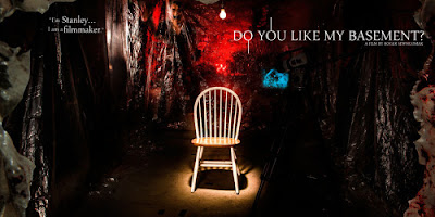
One film that I thought was a very good one to look at was "Do you like my Basement" ( Roger Sewhcomar, out on Netflix) This is a film poster for the film. As you can see, there is a chair surrounded by plastic sheets and blood, which really anchors the horror genre.
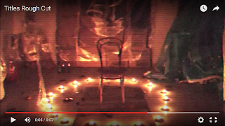
Below is a scene from one of our rough cuts, which is very similar to the one above.
We thought candles were more effective than having lights as they are more conventional of the horror genre.
Representation
The main Character:
Our main character challenges the usual convention of the main character in a horror film, which is that of a Scream Queen. I have blogged more in detail on this character type previously, however, essentially the Scream Queen is usually blonde, very stupid and over sexualised.
Why did we want to challenge this convention?
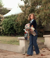 The character of the final girl in film is the opposite of the Scream Queen, she is intelligent, often brunette and usually does not die.
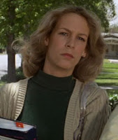
A famous example of a final girl is Laurie from Halloween (John Carpenter, 1978). Her character is very clearly the final girl type as the books have connotations of intelligence. Also her costume is plain and not revealing.
 In our main character's bedroom we took some books and placed them on her bedside table. This connotes again that she is intelligent and studious.
Her costume:
For her costume, I chose a white t-shirt in order to show the character's innocence, as white connotes purity and innocence.
I chose plain blue jeans as they are neutral and a skirt would be more typical of a scream queen character.
She ties her hair in a ponytail because it represents the fact that she is practical.
I also chose the duffle coat for her costume as it's classical and again shows her innocence and simplicity.
To summarise, the main way in which we challenged convention was through the main character, through her costume and character. We thought that it would be good to challenge this idea of the scream queen character as it would make our film a little more individual which is crucial when attracting an audience, and also that we wanted a more positive image (more intelligent, less provocative) of a main female character to be presented to the female demographic of our audience.
The Killer:
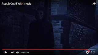
For the killer, the outfit was pretty straightforward. We quickly came to the conclusion that black was a colour greatly linked to killer's costume as it has connotations of darkness and death.
Therefore, Jon wore a black hoodie with black jeans and big black boots.
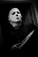
If you look at the costume of Michael Myers (the killer from Halloween) you can see that
 he inspired us.
The idea of having a mask actually came from Halloween and Saw.
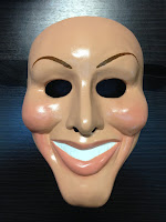
We decided to have the mask look more like an actual face (so skin-coloured, with cuts and bruises) as this is something that features in the film Purge (James DeMonaco, 2013) and the sequel to that, The Purge: Anarchy (James DeMonaco, 2014) Here is an example of the mask from these films:
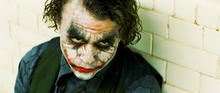
For the mouth area of the mask, we took some inspiration from the character of The Joker.
 We
added cuts to the side of the mouth in order to represent this. We
decided that blood and cuts were a good thing to add to our mask also
because they are a very common feature in the horror genre. The dark
shadows around the eyes on the mask were also inspired by The Joker, and gives a very sinister feeling, again anchoring the horror genre of our film opening.
The titles:
I was the one who created the titles for our film. I started by looking at fonts from other horror films.

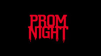 One common trait I found was that many of the titles were in a red font over a black background. From this I already knew that I wanted to use this colour scheme in our own production as both
colours have strong connotations of horror.
 (Cabin in the Woods)
Once I had more of an understanding of which colours to use, I chose 4 of the best fonts from the horror section of dafont.com
I put the fonts into a word document and then passed this out and gathered some audience feedback from each option, as well as asking which one appealed to them most.
I asked this to people who fit into our target audience.
Option 1)
Overall, the people I asked preferred the top two fonts, so I decided to go with option 2 as i also found it very easy to read, but still in keeping with the horror genre.
I then imported the font into Final Cut and experimented a bit with a few different colours/sizes.
I tried to created a smoke effect surrounding the letters, inspired by the titles of The Cabin in the Woods, however i thought that this looked a bit too generic and boring. I then had an idea, inspired by the famous television scene from Poltergeist of adding an "Old TV" filter. I found that this worked very well and decided to go with that.
For the titles we didn't really challenge conventions but instead used them. However, by using the TV filter to the titles I think that I added an individual look to our film opening.
How does our film represent social groups or issues?
In our film opening, we included only Caucasian characters. This was not deliberate, however, we only show two characters (as the amount of characters in horror is very limited) and as the country/area we live in has a large Caucasian population, this would be accurate. However, if we were to be filming a full length film, we would be sure to include characters of different ethnic groups.
In order to represent different nationalities, we included both a British and an American character.
This means that our film would appeal to both an American and a British audience, and also shows diversity.
We have no negative stereotypes surrounding accents, homosexuality or ethnicity, as we didn't want our film to be offensive in any way.
Our film is hegemonic and normative, but this would have been very hard to avoid.
As there are limited amounts of characters in our film, it would be difficult to show a large amount of diversity, however if it was a full film, we would consider including a black or homosexual character in our film (represented in a positive way)
In conclusion, we did our best to show diversity in terms of nationality/accents.
http://asmediafilmopening.blogspot.lu/2016/03/evaluation-cie-q1.html
We decided to do our film opening in the horror sub genre. The genre conventions of horror are very clear and it's normally very easy to identify when a film is horror. However, in terms of character, we decided to challenge this and have included a counter-type in our film opening.
MISE-EN-SCENE
The mise-en-scene played a very large role in our film opening, especially as plays a part in conveying the genre to the audience.
For the basement scene, we wanted it to look very sinister. We started off by looking at some other different horror or slasher films that had a similar scene that we could take inspiration from. One film that definitely inspired us a lot was The Texas Chain Saw Massacre. (Hooper, 1974)
In this film, the "killer" figure has a sort of room which has a lot bones on the walls and there is low-key lighting.
We decided that the bones was a good idea, so we actually used some meat that had a lot of bone on it. We cut away the main part of the meat.
We also bought some string that we thought looked appropriate, and tied the meat to the ceiling of the basement we were using.
We ran a knife along the string to make it look more frayed.
We also went and bought a role of thin plastic, which we hung down from the ceiling, as well as two big thicker plastic sheets which we hung behind the chair. We covered these sheets in fake blood.
Our basement mise-en-scene was inspired by looking at many different basements in horror films. For example, The Conjuring, The Cabin in the Woods.

One film that I thought was a very good one to look at was "Do you like my Basement" ( Roger Sewhcomar, out on Netflix) This is a film poster for the film. As you can see, there is a chair surrounded by plastic sheets and blood, which really anchors the horror genre.

Below is a scene from one of our rough cuts, which is very similar to the one above.
We thought candles were more effective than having lights as they are more conventional of the horror genre.
Representation
The main Character:
Our main character challenges the usual convention of the main character in a horror film, which is that of a Scream Queen. I have blogged more in detail on this character type previously, however, essentially the Scream Queen is usually blonde, very stupid and over sexualised.
Why did we want to challenge this convention?
- We wanted to show a more positive view of women in our production, as we wanted the main character to be more of a 'role model' to the slightly younger demographic of our audience.
- We wanted our film to stand out: There are many horror films, mostly with the scream queen as the main character, and we wanted ours to be a bit different in order to attract an audience.
 The character of the final girl in film is the opposite of the Scream Queen, she is intelligent, often brunette and usually does not die.
A famous example of a final girl is Laurie from Halloween (John Carpenter, 1978). Her character is very clearly the final girl type as the books have connotations of intelligence. Also her costume is plain and not revealing.
 In our main character's bedroom we took some books and placed them on her bedside table. This connotes again that she is intelligent and studious.
 Her costume:
For her costume, I chose a white t-shirt in order to show the character's innocence, as white connotes purity and innocence.
I chose plain blue jeans as they are neutral and a skirt would be more typical of a scream queen character.
She ties her hair in a ponytail because it represents the fact that she is practical.
I also chose the duffle coat for her costume as it's classical and again shows her innocence and simplicity.
To summarise, the main way in which we challenged convention was through the main character, through her costume and character. We thought that it would be good to challenge this idea of the scream queen character as it would make our film a little more individual which is crucial when attracting an audience, and also that we wanted a more positive image (more intelligent, less provocative) of a main female character to be presented to the female demographic of our audience.
The Killer:
For the killer, the outfit was pretty straightforward. We quickly came to the conclusion that black was a colour greatly linked to killer's costume as it has connotations of darkness and death.
Therefore, Jon wore a black hoodie with black jeans and big black boots.
If you look at the costume of Michael Myers (the killer from Halloween) you can see that
 he inspired us.
 The idea of having a mask actually came from Halloween and Saw.

We decided to have the mask look more like an actual face (so skin-coloured, with cuts and bruises) as this is something that features in the film Purge (James DeMonaco, 2013) and the sequel to that, The Purge: Anarchy (James DeMonaco, 2014) Here is an example of the mask from these films:

For the mouth area of the mask, we took some inspiration from the character of The Joker.
 We
added cuts to the side of the mouth in order to represent this. We
decided that blood and cuts were a good thing to add to our mask also
because they are a very common feature in the horror genre. The dark
shadows around the eyes on the mask were also inspired by The Joker, and gives a very sinister feeling, again anchoring the horror genre of our film opening.
 The titles:
I was the one who created the titles for our film. I started by looking at fonts from other horror films.

 One common trait I found was that many of the titles were in a red font over a black background. From this I already knew that I wanted to use this colour scheme in our own production as both
colours have strong connotations of horror.
Once I had more of an understanding of which colours to use, I chose 4 of the best fonts from the horror section of dafont.com
I put the fonts into a word document and then passed this out and gathered some audience feedback from each option, as well as asking which one appealed to them most.
I asked this to people who fit into our target audience.
Option 1)
- Fits well with horror (genre)
- Doesn't look 'scary enough'
- The 'N' is a bit unclear
- I like the dripping from the letters
- Looks like blood
- This one is my favourite because the words are clear and because of the dripping down from the letters.
- The letters are too bold
- Wouldn't fit as well with horror
- Looks too similar to another horror movie
- Not very easy to read
- Would fit well in the film
- Letters are too close together
Overall, the people I asked preferred the top two fonts, so I decided to go with option 2 as i also found it very easy to read, but still in keeping with the horror genre.
I then imported the font into Final Cut and experimented a bit with a few different colours/sizes.
I tried to created a smoke effect surrounding the letters, inspired by the titles of The Cabin in the Woods, however i thought that this looked a bit too generic and boring. I then had an idea, inspired by the famous television scene from Poltergeist of adding an "Old TV" filter. I found that this worked very well and decided to go with that.
For the titles we didn't really challenge conventions but instead used them. However, by using the TV filter to the titles I think that I added an individual look to our film opening.
How does our film represent social groups or issues?
In our film opening, we included only Caucasian characters. This was not deliberate, however, we only show two characters (as the amount of characters in horror is very limited) and as the country/area we live in has a large Caucasian population, this would be accurate. However, if we were to be filming a full length film, we would be sure to include characters of different ethnic groups.
In order to represent different nationalities, we included both a British and an American character.
This means that our film would appeal to both an American and a British audience, and also shows diversity.
We have no negative stereotypes surrounding accents, homosexuality or ethnicity, as we didn't want our film to be offensive in any way.
Our film is hegemonic and normative, but this would have been very hard to avoid.
As there are limited amounts of characters in our film, it would be difficult to show a large amount of diversity, however if it was a full film, we would consider including a black or homosexual character in our film (represented in a positive way)
In conclusion, we did our best to show diversity in terms of nationality/accents.
http://asmediafilmopening.blogspot.lu/2016/03/evaluation-cie-q1.html
Evaluation Question 2: Engaging with audiences and Distribution
How does your product engage with audiences and how would it be distributed as a real media text?
A slasher film is a sub-genre of the horror film genre which usually involves a psychopathic killer stalking and killing victims (or multiple victims) in a very violent and graphic way, the majority of the time with a weapon.
The 25 Bets Slasher Movies
The slasher genre has its own set of conventions which sets it apart from horror and makes it a sub-genre. (Examples of slasher films are the Saw series of films and Halloween) However, horror and slasher films are typically given similar age ratings.
It can be argued that the reason why slasher audiences are made entirely up of adolescents is due to teenage society. Because violent films are looked down upon by film critics and authority figures, teenagers want to rebel against this and this is what drives them to watch the movies. Another thing which attracts a young adult audience is the 'thrill' that they receive from viewing horror/slasher films.
For our film, we knew that we had to stick to a very specific and typical target audience. This is because the slasher genre has often been called an example of 'genre purism' essentially, this means that the conventions of the genre have been in place so long, and are so specific, that attempting to deviate too far from tradition or changing these conventions can result in a films financial failure. This leads onto how our film opening engaged with our audience/audiences, which I will be covering later on.
Typically, the target audience
for horror/slasher films is 15-25 years old. Although quite a few of these films have an age rating of 18, 15 year olds still have access to films online or on DVD, making it difficult to enforce these age ratings.
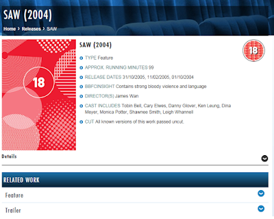
Here is the BBFC page for Saw, which shows the rating and explains why it was given.
So, deciding the age of our target was very straightforward, as we have the same target audience of the majority of slasher films that exist.
I found some statistics based around the ages and genders of horror movies.
As can be seen, the majority of horror film viewers are between the ages of 18 and 24.
To finish, the target audience of our film would be 15-24, and the secondary audience being 26-35.
So for our film, due to the fact that the second largest percentage of viewers of horror is 25-34, we decided that this would be our secondary audience.
(Please note that I accidentally said the 'film cycle' when I should have said 'production'!!)
After explaining distribution in the video, I wanted to talk about how our film would be distributed.
Our film would actually be an Indie film. (independent film)
An indie film is a film production resulting in a feature film that is produced mostly or completely outside of the major film studio system, in addition to being produced and distributed by independent entertainment agencies.
Independent films are sometimes distinguishable by their content and style and the way in which the filmmakers' personal artistic vision is realized. Usually, but not always, independent films are made with considerably lower budgets than major studio movies.
Indie films allows the director and team to have more flexibility and creativity.
This means that we, as the film producers would not hire other large companies to distribute and market our film but instead would do this ourselves.
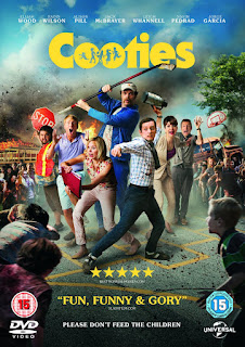
Examples of indie horror film:
"The Boy" and "cooties"
A really good article I looked at when researching Indie film making was about the advantages Indie has over Mainstream:
To summarize the article, there are 3 main things that make indie films more advantageous.
1. You don't have to follow the 'pattern' that big movie directors usually do, so you have more freedom of creativity.
2. Your film doesn't have to be as predictable, as major films don't like to take risks as much.
3. There is the possibility of new actors. To attract audiences, they often include a list actors in horror films (and films in general) however, this can get a bit boring.
SO, for our film, we would not have a separate production and distribution company but instead would produce and distribute the film ourselves, making it an indie.
A slasher film is a sub-genre of the horror film genre which usually involves a psychopathic killer stalking and killing victims (or multiple victims) in a very violent and graphic way, the majority of the time with a weapon.
The 25 Bets Slasher Movies
The slasher genre has its own set of conventions which sets it apart from horror and makes it a sub-genre. (Examples of slasher films are the Saw series of films and Halloween) However, horror and slasher films are typically given similar age ratings.
It can be argued that the reason why slasher audiences are made entirely up of adolescents is due to teenage society. Because violent films are looked down upon by film critics and authority figures, teenagers want to rebel against this and this is what drives them to watch the movies. Another thing which attracts a young adult audience is the 'thrill' that they receive from viewing horror/slasher films.
For our film, we knew that we had to stick to a very specific and typical target audience. This is because the slasher genre has often been called an example of 'genre purism' essentially, this means that the conventions of the genre have been in place so long, and are so specific, that attempting to deviate too far from tradition or changing these conventions can result in a films financial failure. This leads onto how our film opening engaged with our audience/audiences, which I will be covering later on.

Typically, the target audience
for horror/slasher films is 15-25 years old. Although quite a few of these films have an age rating of 18, 15 year olds still have access to films online or on DVD, making it difficult to enforce these age ratings.
Here is the BBFC page for Saw, which shows the rating and explains why it was given.
So, deciding the age of our target was very straightforward, as we have the same target audience of the majority of slasher films that exist.
I found some statistics based around the ages and genders of horror movies.
As can be seen, the majority of horror film viewers are between the ages of 18 and 24.
To finish, the target audience of our film would be 15-24, and the secondary audience being 26-35.
Primary and secondary target audience
The primary audience is the audience that the film is primarily target at, so the main people who will watch the film, for example. When creating a film, the target audience is something extremely important to consider as failing to appeal to the target audience could result in the failure of the film.
The secondary audience are people who wouldn't go and watch a film by choice, but would perhaps be influenced by the primary audience. To explain, a young teenager who really wants to see a film (and would be the primary audience) could bring someone with them, a parent or a friend for example to watch it with them, making them the secondary audience.
As seen in the pie chart, more men than women watch horror films.
This is because they can interact or relate better to the characters on screen, and the main killer is normally a man.
Women are less attracted to horror, for reasons such as the negative portrayal of women in such films.
Character types such as the final girl are stereotypical and very negative.
However, including romance or aspects of romance in horror/slasher films also attracts women to the film, and making horror films good 'date films'; the romance aspects appeal to the women and the gory/horror aspects to the men.
Therefore, our primary target audience is men as they view horror more than women.
On the other hand, we actually wanted our film to appeal more to women than the average slasher movie, by representing our main character differently and ensuring that it would pass the Bechdel test. (I expanded further on this on another blog post.)
So how exactly does our film engage with our audience?
Now that we know what the audience is, how did we enable them to engage with our film and how did we appeal to them?
These are the ways in which our film engages with our audience:
-Narrative enigma
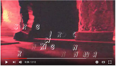 At the beginning of our film opening, we had a black screen as this builds tension, and you don't know whats going to happen. We only showed the killer's feet at first, making it very dramatic. To create narrative enigma throughout the entirety of the film opening, we only showed the face of the killer (the mask) at the very end of the film opening.
-A false scare
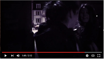 The false scare that we added in our film opening, really helped the audience engage with the film opening. It would have hopefully made them scared or jump and so they felt the same emotions as the central protagonist, allowing them to relate to the character, and feel involved in the film.
-Accents
As I wrote about in my evaluation question 1, we tried to show diversity of accents in our film opening. We were successful in doing so as we had an English and American accent.
-Music
Through the music, we also hoped that our audience would be able to engage/relate to our film opening.
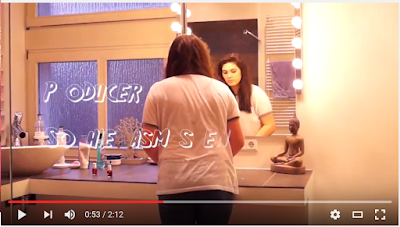 In the scene where I (the central protagonist) was in the bathroom, There is someone singing "What Makes You Beautiful" by the band One Direction. This would be instantly recognizable to a fan and also helping attract a female audience /engaging with the female audience as the target audience of this band are primarily females.
The music also created a tense atmosphere which really helps a viewer engage in what is happening on-screen.
-Intertextuality
The name of our central protagonist is Casey Crane which is an intertextual reference to characters from famous horror films, such as Scream and Psycho. This reference will also help us to target our secondary audience as they are older and will have watched these older films. When they recognize this reference, it will give them a sense of satisfaction.
There is more detail on this on the blog post: Choosing the name for our "Final Girl"
How would it be distributed as a real media text?
Before fully answering the question, I wanted to look at distribution and things such as production. I decided to do this on a whiteboard with a voice-over as I thought that it was an interesting, different and creative approach -Narrative enigma
 At the beginning of our film opening, we had a black screen as this builds tension, and you don't know whats going to happen. We only showed the killer's feet at first, making it very dramatic. To create narrative enigma throughout the entirety of the film opening, we only showed the face of the killer (the mask) at the very end of the film opening.
-A false scare
 The false scare that we added in our film opening, really helped the audience engage with the film opening. It would have hopefully made them scared or jump and so they felt the same emotions as the central protagonist, allowing them to relate to the character, and feel involved in the film.
 -Accents
As I wrote about in my evaluation question 1, we tried to show diversity of accents in our film opening. We were successful in doing so as we had an English and American accent.
-Music
Through the music, we also hoped that our audience would be able to engage/relate to our film opening.
 In the scene where I (the central protagonist) was in the bathroom, There is someone singing "What Makes You Beautiful" by the band One Direction. This would be instantly recognizable to a fan and also helping attract a female audience /engaging with the female audience as the target audience of this band are primarily females.
The music also created a tense atmosphere which really helps a viewer engage in what is happening on-screen.
-Intertextuality
The name of our central protagonist is Casey Crane which is an intertextual reference to characters from famous horror films, such as Scream and Psycho. This reference will also help us to target our secondary audience as they are older and will have watched these older films. When they recognize this reference, it will give them a sense of satisfaction.
There is more detail on this on the blog post: Choosing the name for our "Final Girl"
How would it be distributed as a real media text?
(Please note that I accidentally said the 'film cycle' when I should have said 'production'!!)
After explaining distribution in the video, I wanted to talk about how our film would be distributed.
Our film would actually be an Indie film. (independent film)
An indie film is a film production resulting in a feature film that is produced mostly or completely outside of the major film studio system, in addition to being produced and distributed by independent entertainment agencies.
Independent films are sometimes distinguishable by their content and style and the way in which the filmmakers' personal artistic vision is realized. Usually, but not always, independent films are made with considerably lower budgets than major studio movies.
Indie films allows the director and team to have more flexibility and creativity.
This means that we, as the film producers would not hire other large companies to distribute and market our film but instead would do this ourselves.

Examples of indie horror film:
"The Boy" and "cooties"
A really good article I looked at when researching Indie film making was about the advantages Indie has over Mainstream:
To summarize the article, there are 3 main things that make indie films more advantageous.
1. You don't have to follow the 'pattern' that big movie directors usually do, so you have more freedom of creativity.
2. Your film doesn't have to be as predictable, as major films don't like to take risks as much.
3. There is the possibility of new actors. To attract audiences, they often include a list actors in horror films (and films in general) however, this can get a bit boring.
SO, for our film, we would not have a separate production and distribution company but instead would produce and distribute the film ourselves, making it an indie.
Evaluation Question 3: Developement of Production Skills
How did your production skills develop throughout this process?
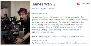 So to answer this question, me and Sophie worked together to create a TV show style video. We took on the roles of me as James Wan (famous horror film director) and with Sophie as Ellen DeGeneres. Then we asked each other question in order to answer the evaluation question. We talked about the process that we went through to produce our films, and also how our skills developed.
We did this as a skype interview, with me appearing on the show by webcam.
We tried to expand as much as possible on each question, also being quite specific.
 So to answer this question, me and Sophie worked together to create a TV show style video. We took on the roles of me as James Wan (famous horror film director) and with Sophie as Ellen DeGeneres. Then we asked each other question in order to answer the evaluation question. We talked about the process that we went through to produce our films, and also how our skills developed.
 We did this as a skype interview, with me appearing on the show by webcam.
We tried to expand as much as possible on each question, also being quite specific.
Evaluation Question 4: Integrating Technologies TBC
How did you integrate technologies - software, hardware and online - in this project?
The technologies that we used throughout the course of the year really helped us to produce our blogs (evaluation questions included) and also our film opening.
Hardware
The camera that we used throughout the process of filming was the SONY A58 we borrowed this from the school media studies department.
Before filming, I viewed a guide online of the various functions of the camera to familiarize myself with how to use it.
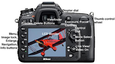 I learned different functions such as how zoom in and out and the difference between taking photos and filming and how to change between the two. We used this camera for every piece of filming we did.
As I was acting in the film, this meant that I had less opportunity to film scenes. However, I did some filming on the establishing shots/ shots I wasn't in.
I also filmed all of the directing done by Jon and Sophie.
An example of a technique we used with this camera was deep-focus. We utilized this in the church scene when filming the candles.
We used manual focus throughout filming as in our Swede (a preliminary exercise) we found that the auto focus created a clicking sound which was very distracting. The auto-focus also made our short swede go in and out of focus which was very annoying. As I said, we used manual focus to avoid this.
The Tripod
At the beginning of the year, we started by using a Cullmann CB6 Tripod. This was provided by our school. However, It was quite shaky.
Before beginning filming, we received a new Mantona Scout tripod which was much sturdier and easier to use.
As the tripods were very simple to operate, it wasn't very hard to use them. I had also used a tripod in my Gcse Media therefore I knew how it worked
We used a tripod in almost every scene we filmed as we knew how important steady footage is and the tripod insured the footage was steady.
The scene in which we didn't use a tripod was towards the end of our film opening, during a POV shot. This was for effect as the slightly shaky footage provided tension and suspense.
SD card
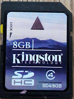 We used my Kingston 8GB SD card. If we were to do this project again, I would have chosen an SD with more storage, simply down to the fact that we ran out of space a couple of times during filming and had to stop filming to import it onto a Mac.
The SD was very easy to use as all of our laptops had SD card slots, making it easy to transfer footage through it.
Something that could have helped us, would have been to have another SD card on us at all times incase something went wrong during filming.
Smartphone
I used my phone a lot during the entire process.
Firstly, I used it to record audience feedback. It was very useful for this as I always had my phone on me and so, whenever there was an opportunity to record or get some audience feedback, I just quickly filmed it on my phone.
My phone also allowed me to access my emails and messages quickly meaning I was in touch with my team mates at all times.
Laptop/computers
 When in school, i tended to use the computers provided by the school (Fujitsu) however, I actually had quite a lot of difficulties when using blogger on these computers (I couldn't embed videos, and the font size/colour kept changing after publishing the post).
Therefore, I did all of that at home on my own personal laptop (ASUS).
I also borrowed Sophie's laptop when doing some editing as my laptop is not a mac and so I couldn't use final cut on it.
Software/Online
My phone also allowed me to access my emails and messages quickly meaning I was in touch with my team mates at all times.
Laptop/computers
 When in school, i tended to use the computers provided by the school (Fujitsu) however, I actually had quite a lot of difficulties when using blogger on these computers (I couldn't embed videos, and the font size/colour kept changing after publishing the post).
 Therefore, I did all of that at home on my own personal laptop (ASUS).
I also borrowed Sophie's laptop when doing some editing as my laptop is not a mac and so I couldn't use final cut on it.
Software/Online
Final Cut Pro
The editing software that we used was Final Cut Pro. When starting this project I didn't know how to use the program at all as I had never used it before. However, It was very easy to pick up. I looked online at a couple of guides on the different tools and what shortcuts there were. I figured out how to change the font size and colour by myself but it was very clear and easy to use, so it didn't take long at all to figure out.
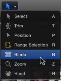
I have created a quick guide of the tools.
The first one is Select. (cmd A) This is just the usual arrow that you would use to drag clips in to place, or re-arrange them.
The Trim tool (cmd T) can be used to cut the end or beginning of a clip. For example, if you want to shorten a scene/clip, you just change to this tool and then drag away however much you want
The Position tool (cmd P) manually places a clip in a specific location without involving other clips.
If you drag a clip over another using this, it will overwrite it.
The Range Selection tool (cmd R) allows you select a certain section of a clip. This is very useful when importing footage, as you can select a certain part of the footage to add to your timeline.
The Blade tool (cmd B) is used to 'cut' a clip. To do this you just select the tool and then click on the place where you want to split the clip.
The zoom tool (cmd Z) is pretty self-explanatory, you can just use this to zoom in or out on the timeline.
The last one is the hand tool (cmd H) and it allows you to move the Timeline back and forth
Sony Vegas Pro
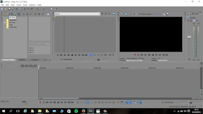 Because I don't have a mac, when I was at home, I used Sony Vegas Pro to edit things I did. I didn't actually like using it very much as it was complicated to use compared to Final Cut. The layout was a bit confusing to me and it took a while to get used to .
I much prefer using Final Cut as its much more simple and easy to understand and work with.
To communicate as a group, we used a chat.
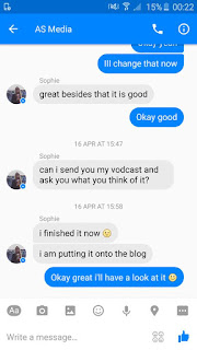 This was extremely useful as we could share photos and links among ourselves.
We also could discuss things about our film, such as whether it was going to be an indie film or not.
It was also very useful for arranging when to meet up to do filming or other things that were coursework-related.
Google Drive
Another way in which we integrated technologies was through Google Drive. This is a screenshot of what our Google Drive looked like at one point during the year:
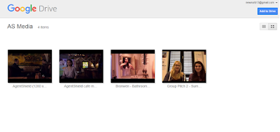
This again, was really useful as it allowed us to share clips and videos to each other. This was actually my first time using google drive but I found it really straightforward and easy to work with.
Jon set it up and then Sophie sent me an invitation to edit it over gmail which enabled us to share content onto it.
I would really recommend this as a way of sharing videos as its very quick and easy to use.
Skype
Finally, me and Sophie used Skype to work on our coursework together, usually on weekends.
 We actually used this when doing evaluation question 3, as we screen-recorded our chat show style Skype session.
 Skype was very practical and helped us a lot when we wanted to discuss something that would be too complex over text/chat and would take a while to talk about.
Subscribe to:
Comments (Atom)


