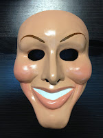
However, we also added our own ideas to make it individual.
For the mouth area, we wanted to create a skeleton or skull effect so we looked at some different images like this for example:
We thought that having the mask painted to look like skin with cuts and bruises would add a good and also individual look to the mask. We also wanted the mask to be quite scary.
The idea of having a mask/ masked killer in our film opening was inspired from the film Halloween (John Carpenter, 1978)
This is the mask that the killer wears in the film:
We got the idea of having the mask look more like an actual face (so skin-coloured, with cuts and bruises) From the film he Purge (James DeMonaco, 2013) and the sequel to that, The Purge: Anarchy (James DeMonaco, 2014) Here is an example of the mask from these films: For the mouth area of the mask, we took some inspiration from the character of The Joker.
We added cuts to the side of the mouth in order to represent this. We decided that blood and cuts were a good thing to add to our mask also because they are a very common feature in the horror genre. The dark shadows around the eyes on the mask were also inspired by The Joker.
This is a time lapse that we filmed when making the mask:


still 'tbc'?
ReplyDelete